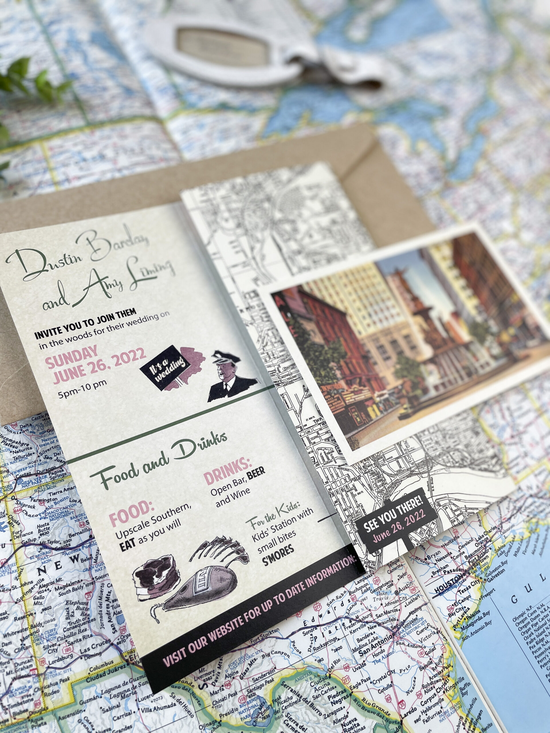
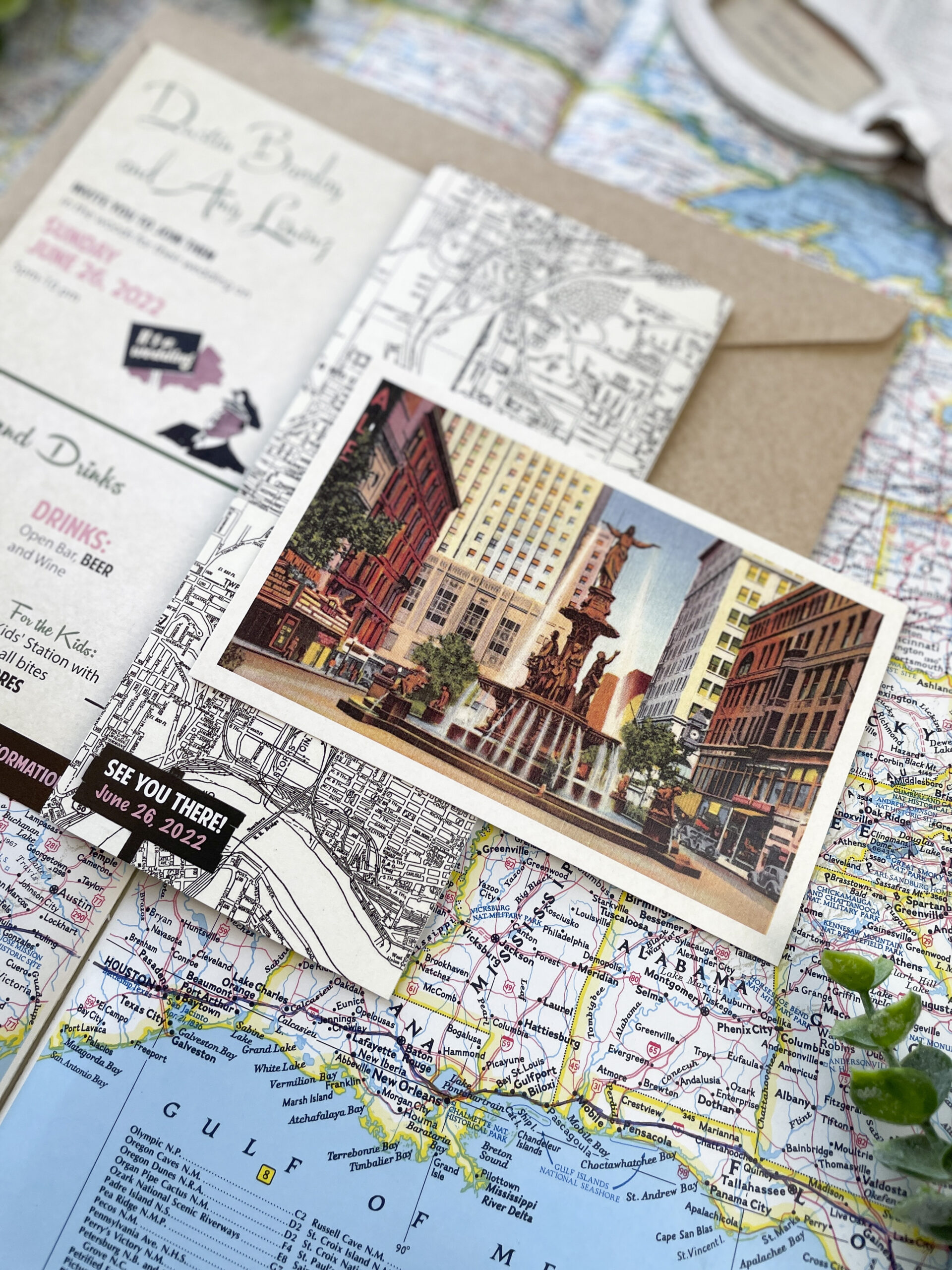
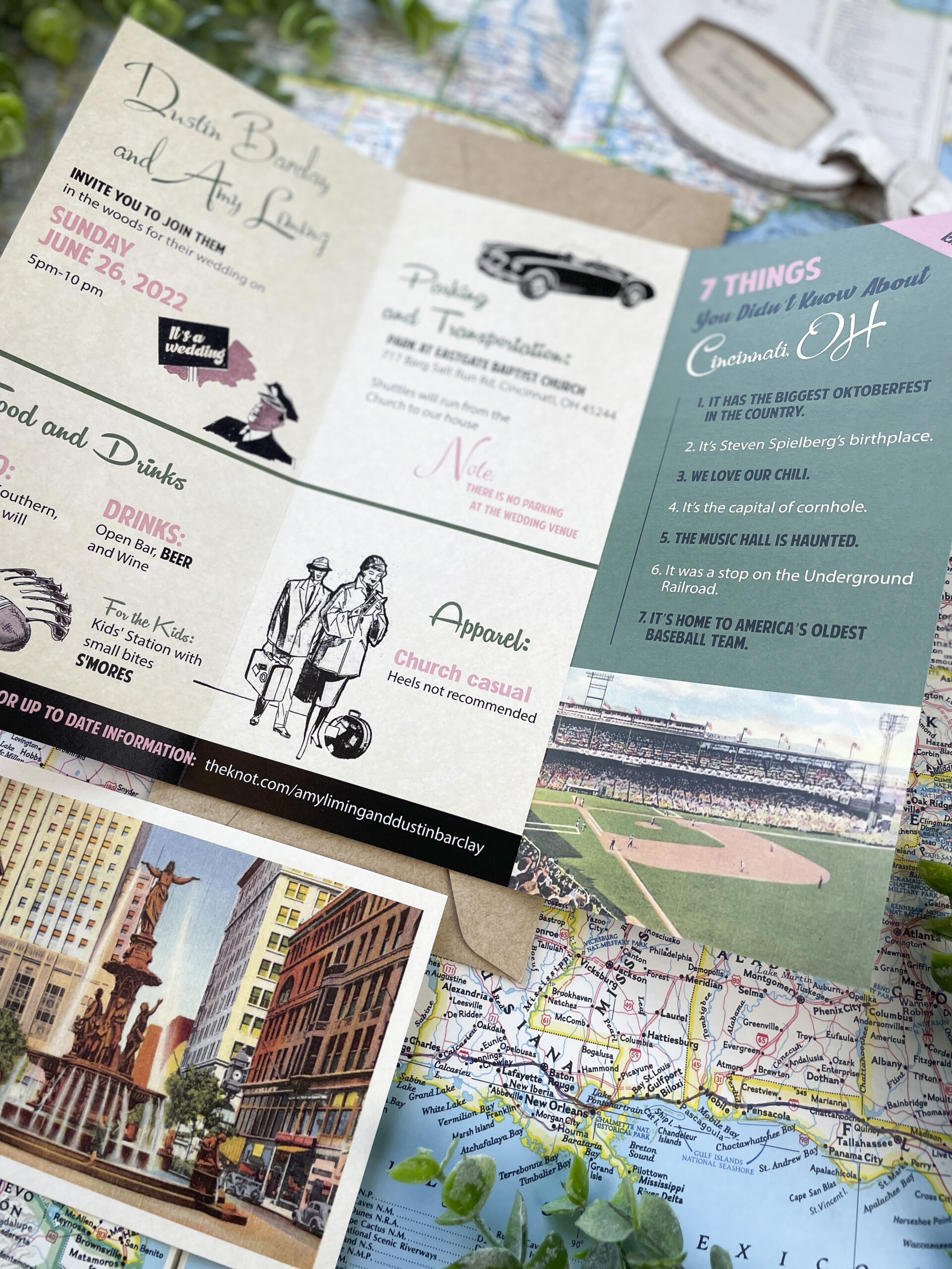
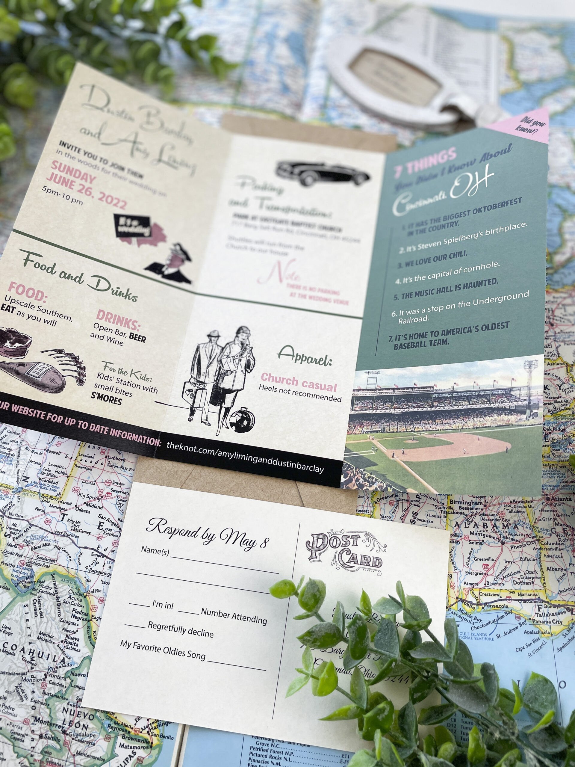
More B R O C H U R E invites please! Seriously…this invite was SO MUCH FUN to work on (and yes, I know I say that about every design)…but a retro brochure wedding invite! With pink! And a vintage postcard RSVP. And a map! I could go on and on…
Here’s how it came together! My client asked for a brochure themed invite for her wedding in Cincinnati, and sent me several brochures from the 50’s for inspiration. All of them had something really unique – the illustrations, fonts, color blocking, history, maps, etc. I really wanted to combine all of these ideas, but still have it make sense as a wedding invitation. I used black and white illustrations and added very simple color to them and used them to break up the wedding and reception in to little sections. I added a fun facts panel to add some contrast and color. The back of the brochure has a map spanning two panels, and the RSVP is a retro style postcard (of course). I also added a vintage paper texture to the entire brochure and postcard to make look more worn. I loved how this turned out, but my client said her guests RAVED about it – and that’s the ultimate compliment!
